Mobile-Responsive website
- Mobile-Responsive means the website is designed to resize blocks of information to fill each size device screen with different amounts of information to make it more readable.
- Google search makes a responsive website more visible
- No "pinching" to enlarge text to read.
- As smart phones and handheld devices command more use, mobile-responsive website design is more popular.
- Google search engine, which is how people find you, favors mobile-responsive design.
Traditional website
- Traditional means the appearance remains the same on all devices.
- Google search makes a traditional website less visible.
- To re-size content heavy pages you must "pinch" the screen on a smart phone and handheld device.

Mobile-Responsive website page.
The following example shows a Mobile-Responsive website page viewed on 3 different sized devices. These pages automatically resize the content for easy reading on each device. Google search makes responsive websites more visible.


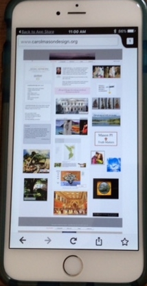
Traditional website page.
The following example shows a Traditional website page viewed on 3 different sized devices. These pages don't resize. Instead one must "pinch" open the content to read. Google search makes a traditional website less visible.